Gentri - Website Audit
We were hired to work with new premium Gentri for their marketing and also website audit.
This audit is to summarise potential user issues, e-commerce conventions and any other website issues which may create future friction for your customers.
All of the notes we made on what needed to change have now been taken into action on the Gentri site.


The site needed to keep a consistent look. Three out of the four items' weren’t available, we advised adding a coming soon or sold out for the ones which aren’t available.
This is to eliminate confusion amongst consumers who are interested in the products.
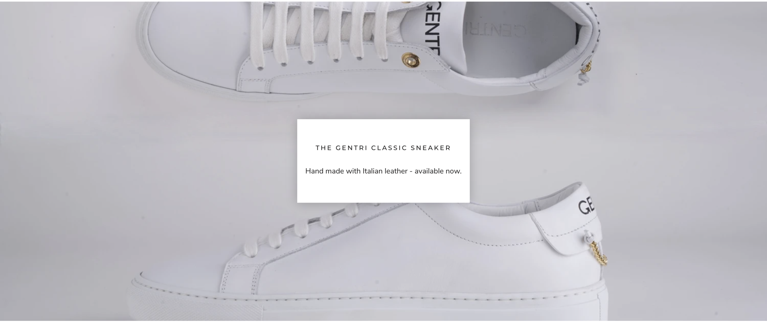
Due to the background and image shadow we suggested to add a white box around the “available now” to make it more visible.
The shadow clash is an accessibility issue as the contrast is low and can cause issues for users browsing the site.
The pricing on the site is in pounds, however, the sizing is in European measurements. We suggested to add the alternative or change it from european to UK. Sites which pay in pounds will usually have English sizing too.


As the site had just launched, a number of the items weren’t available. What Gentri failed to do was include any option for users to either sign up to a newsletter or register their interest. Multiple sections had blank spaces which users would see and leave as there wasn’t a CTA for them to purchase or register interest.
The menu at the time was also hidden so the touchpoints weren’t easy accessible for users to browse the website.


The CTA’s didn’t go to the right place. Clothing and headwear went to all the collections and sneakers went to the one sneaker rather than a page. This would have made the user’s journey confusing and probably led them to leaving the site.
Further Suggestions
Add a live chat or customer support to improve customer relations
If possible, remove the hamburger menu (both mobile and desktop) can be seen as outdated
When the reviews start, add them to the website
Add more information to the product details
Add video to the products - e.g. of someone trying it on and walking around
Add email address to the contact page, people prefer to email rather than think their message is just being sent to an automated system
Add related products to the product pages